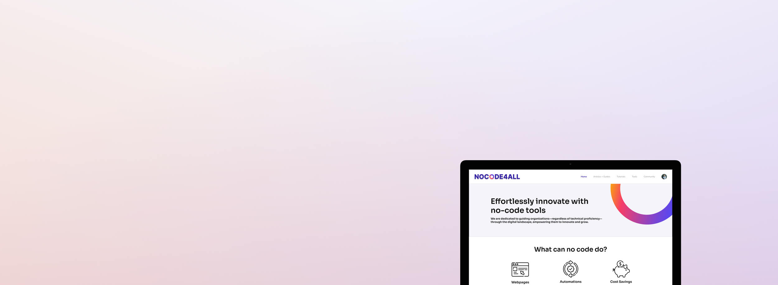
No Code for All
Build and automate without coding
A nonprofit dedicated to equipping other nonprofits with the tools and resources needed to build and manage their organizations effortlessly, without the need for coding skills.
Overview
We were entrusted with developing a website for a nonprofit organization, collaborating closely with its founder to bring his vision to life. Our goal was to design the site so it could be easily managed by the nonprofit's team, ensuring a seamless handoff and sustainable future.
Problem
Many organizations struggle to get off the ground due to a lack of knowledge and tools needed to establish a stable nonprofit. A significant barrier is the lack of coding expertise. Coding can be daunting for those unfamiliar with it, often discouraging them from even attempting to learn. As a result, many nonprofits fail before they have a chance to start.
Solution
No Code for All aims to provide other nonprofits with tools and resources to help develop their organization without the need for coding. They offer solutions like website builders that require no coding and resources to create automations that enhance productivity and streamline workflows.
Role
Lead UI/UX Designer
Team
Myself (Lead UI/UX Designer)
1 Product Manager
6 UI/UX Designers
Research
Literature Review
Our literature review highlighted key challenges and opportunities in nonprofit technology adoption, particularly with no-code tools. Financial constraints, outdated technology, and lack of IT support create a strong need for accessible no-code solutions to enhance efficiency and digital reach. Despite financial hurdles, expertise gaps, and leadership reluctance, many nonprofits have successfully used no-code tools to improve donor and volunteer management, as well as program efficiency. These successes demonstrate the transformative potential of no-code solutions, underscoring the importance of platforms like NoCode4All in making these tools more accessible to the nonprofit sector.
Market Analysis
Our market analysis examined companies like Looppanel, NoCode.Tech, Thunkable, NoCode Institute, Xelence, and Nocode HQ, revealing key insights into the no-code platform landscape. These platforms excelled in providing educational resources, user-friendly interfaces, and community support. However, common weaknesses included difficulty navigating content, limited tool usage information, mobile-only access, outdated interfaces, steep learning curves, pricing transparency issues, and reliance on video tutorials. While valuable, these platforms have room for improvement, and NoCode4All aims to address these gaps to better support nonprofits in adopting no-code solutions.
Lo-Fi Prototypes
We began by focusing on the homepage, as it serves as the face of the website and the client wanted it to be perfect.
After developing an initial sitemap hierarchy and design system, we created a low-fidelity (Lo-Fi) prototype to outline the basic structure and content placement. This helped us grasp the client's vision and user requirements. We focused on integrating various page components, such as the table of contents, search bar, and testimonials, to ensure a seamless user experience. Additionally, we created multiple versions of pages to test and identify the optimal layouts for each page's functionality.
Med-Fi Prototypes
With the article page, we began integrating the color palette into the website, providing both us and the client with a clearer vision of the final product.
As we moved to a medium-fidelity (Med-Fi) version, we refined the user interface with improved design elements and functionality, ensuring the website was both professional and inviting for NoCode4All’s diverse audience. We incorporated warmer tones like oranges and pinks to create a cozier atmosphere and redesigned components such as the search and filtering features to adopt more intuitive designs commonly seen on other blog websites.
Hi-Fi Prototypes
We then refined our approach and transitioned into the high-fidelity (Hi-Fi) prototype, presenting a polished version of the site with full-color designs, advanced interactivity, and a clear depiction of the final product. This phase represented the culmination of our design research, client and user engagement, and feedback from external designers, ensuring each web page resonated with the brand identity.
We conducted extensive user testing to ensure our final design provided an optimal experience for users navigating the NoCode4All resource hub. Some final changes included:
- Separating multimodal content (tutorials) from text-based content (articles) for clearer navigation.
- Adding ratings for each tool in the tool directory.
- Moving "Who We Support" information to the homepage to emphasize community values.
Our Hi-Fi website design successfully supports the full range of functionality we aimed to achieve for NoCode4All.
Searching and Filtering
Users can dynamically search and filter educational content to find the tutorials/articles best suited for them.
Maintaining Profile and Subscription Plan
Editing one’s profile and upgrading/downgrading plans is as simple as a click of a few buttons, ensuring the transparency that other no-code training platforms lacked.
Exploring No-Code Tools
They can also peruse our tools directory to learn more about cutting-edge no-code technology and what our community recommends using.
Results and What I Learned
Managing Other Designers
I stepped into a leadership role a month into the project, managing and guiding the design team while quickly getting up to speed on its progress. I balanced my design work by ensuring everyone stayed on task, improving my organizational skills by scheduling team sessions and setting a strong example for others.
Managing Client Relations
As the lead designer for the project, I, along with the project manager, served as the primary contact points for the client. I learned how to manage client expectations and ensure that all our work met their standards.


