ZotRecs
Scheduling made easier
Effortless Enrollment: Elevating the Way You Sign Up for Classes
Overview
My team and I have embarked on the mission of revitalizing UCI's class enrollment webpage and enhancing the overall class sign-up experience.
Problem
The class sign-up experience was highly frustrating due to the need for numerous programs to be open simultaneously in order to create a class schedule. Additionally, the website suffered from sluggishness and unresponsiveness.
Solution
We recreated the class enrollment website, significantly improving site readability and incorporating features that streamline the sign-up process.
Team
Myself (UI/UX Designer)
5 (UI/UX Designers)
Role
I was responsible for designing the website's aesthetics and creating the class page.
Research
User Research
To ensure that our app addressed the pain points of students, we conducted interviews to gauge their opinions regarding the existing class sign-up page. By gathering valuable insights from these interviews, we aimed to create an app that effectively addressed the specific needs and concerns of students.
92%
Majority of students use some sort of planning software to schedule classes easier
Here is the initial class search page
100%
Every single student interviewed checked external sources to see the ratings of professors
The data we collected revealed a consensus among the student population, as the majority shared similar views about the shortcomings of the current system. Students frequently expressed frustration with the outdated infrastructure of the sign-up system, leading to numerous complaints. When informed about the possibility of a new and streamlined process, there was widespread eagerness and anticipation.
Here is the list of classes
95%
Majority of students were frustrated with the current class sign-up systems
Storyboard
Using the gathered user data, I developed a compelling storyboard depicting a student's journey through the class sign-up process. The storyboard showcases the student seamlessly navigating the app, effortlessly searching for available classes, conducting thorough research on each class, efficiently organizing a well-structured daily schedule, and ultimately successfully registering for the chosen classes.
Wireframing
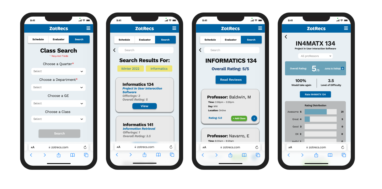
In order to create a user-friendly interface for the initial class search page, I focused on designing a clean and easily readable layout. Given that the designs were specifically intended for mobile devices, I aimed to convey relevant information without overwhelming the screen. The goal was to strike a balance between simplicity and providing sufficient details to assist users in finding the desired classes efficiently.
User Testing and Hi-Fidelity Wireframes
These are the culminating designs I've crafted, tailored specifically for mobile phone use to eliminate the need for any superfluous app downloads. Through rigorous user testing, I've ascertained that the class search section of the app is not only user-friendly but also comprehensible for those who require its functionality.
Results and What I Learned
Learning to Use My Tools
During this project, I faced challenges with utilizing the advanced features of Figma. As a result, I invested additional time in researching and seeking guidance from my team to learn how to execute specific processes effectively.
Communicating with the Team
Effective communication among designers is crucial. This project taught me the importance of communication in ensuring cohesive designs, as lack of communication can lead to the need for redesigning work to achieve consistency.


